
How To: Extract step counts from iPhone Health app and visualize using R
No better way to ring in the new year than by starting your health journey behind a computer

In the spirit of health resolutions that will undoubtedly sweep the world in the next few weeks, I'm going to walk through (pun intended) how to extract step count data from your iPhone Health app and analyze it using R.
Last year I wrote about my step count trends for 2021, and am now revisiting that post for 2022, but through a tutorial lens. I'll try not to bore you with analysis of my personal health journey but will instead provide instructions on how to visualize your own. If you're not interested in how to create the below graphics using R feel free to ignore this post.
Let’s dive in.
Export Health Data
As Rostrum mentioned in their similar blog post1 last year, you can export your health app data stored locally on your iPhone. It’s provided as a structured XML file, which is a common web format but may not be necessarily that familiar to the general R user, so I'll provide instructions on how I did it:
Opened the Health app on my iPhone and tapped my icon in the top right corner
Scrolled down and tapped ‘Export All Health Data’
Chose to Airdrop to my MacBook Air laptop where I have R installed for further analysis. The files get saved in your downloads folder using this method.
Follow the steps above and you’ll get a zipped folder containing two XML files, export_cda.xml and export.xml. We'll work with the latter.
Please note that prior to iOS 16 the above steps worked smoothly. Unfortunately, things have changed slightly on the latest OS. Fortunately, we have a savior in the form of user etresoft in the Apple discussions forum. You will have to follow those six step instructions they outline on how to repair your XML export file, otherwise you will run into parsing errors in the data processing steps below.
Once you’ve completed those magical steps read in your export-fixed.xml file. I did it using read_xml() from the xml2 package for R. Then use the function xml2::xml_find_all() to return all matching Record nodes as this is where step count information and other related metadata live.
Note: depending on how much history you have in your Health app reading this in will take some time.
## Setup

# Be sure to load necessary packages and define theme functions. All this code can be found in the GitHub link at the bottom of the post.


## Read in the data

temp <- tempdir()
unzip(zipfile = "/Users/Stephan/Desktop/R Projects/Health/export 3.zip", exdir = temp)

# needed a workaround to get to this point. Apparently it's messed up in iOS16: https://discussions.apple.com/thread/254202523

xml_in <- read_xml(file.path("/Users/Stephan/Desktop/R Projects/Health/apple_health_export/export-fixed.xml"))

#let’s grab all the ‘record’ nodes and preview the first one (can take a while)
records <- xml_find_all(xml_in, "//Record")
records[[1]]
From there we need to pass a named vector of each attribute to xml2::xml_attr() using purrr::map_dfr() to collate the output into a rectangle of tidy data.
You can see metadata for this xlm_document in the first few rows if you preview the data and the actual data stored in a series of ‘nodes’. Each record is an individual entry in our activity log and has attributes like type (e.g. step count), sourceName (i.e. the device name like your Apple Watch) and a unit (e.g. a count).
# Pass a named vector of each attribute to xml_attr() using purrr::map_dfr() to collate the output into a tidy rectangle.
records_df <- map_dfr(  # rowbind to dataframe
    c(date = "creationDate", type = "type", source = "sourceName", steps = "value"),
    ~xml_attr(records, .x)
)

glimpse(records_df)  # preview


Rows: 2,852,576
Columns: 4
$ date   <chr> "2019-05-06 17:30:50 -0600", "2019-05-06 17:30:50 -0600", "2019-09-19 12:06:18 -060…
$ type   <chr> "HKQuantityTypeIdentifierHeight", "HKQuantityTypeIdentifierBodyMass", "HKQuantityTy…
$ source <chr> "Health", "Health", "Stephan’s Apple Watch", "Stephan’s Apple Watch", "Stephan’s Ap…
$ steps  <chr> "5.91667", "150", "76", "72", "65", "62", "63", "57", "60", "66", "61", "67", "60",…
To retrieve only step count data we’ll isolate HKQuantityTypeIdentifierStepCount, convert the date to datetime class and then summarize the number of steps per day.
One thing I’ve noticed is the step count values seem to be inflated vs what they truly should be. Thus, I’ve added a column in the resulting dataframe to account for a calculated adjustment2 to the counts.
We’re then ready to create some fancy charts.
records_preview <- records_df %>%
    filter(type == "HKQuantityTypeIdentifierStepCount") %>%
    mutate(date = as.Date(date), steps = as.integer(steps))

records_out <- records_df %>%
    filter(type == "HKQuantityTypeIdentifierStepCount" | source == "Stephan's Apple Watch") %>%
    mutate(date = as.Date(date), steps = as.integer(steps)) %>%
    group_by(date) %>%
    summarise(steps = sum(steps), .groups = "drop") %>%
    mutate(
        points = case_when(
            steps > 12500 ~ 8L, steps > 10000 ~ 5L, steps > 7000 ~ 3L,
            TRUE ~ 0L
        )
    )


# format dates and days
records_out <- records_out %>%
    mutate(year = format(
        as.Date(records_out$date, format="%d-%m-%Y"),"%Y")) %>%
    mutate(month = month(ymd(date), label = TRUE, abbr = FALSE)) %>%
    mutate(weekday = wday(ymd(date), label = TRUE, abbr = FALSE))


# adjustment needed bc data isn't all that accurate
records_out <- records_out %>%
    mutate(steps_adj = steps*(1/1.7))

# count days in each month
days_month <- records_out %>%
    filter(year == 2022) %>%
    count(month)

# inspect data frame

> head(records_out)
# A tibble: 6 × 7
  date       steps points year  month    weekday   steps_adj
  <date>     <int>  <int> <chr> <ord>    <ord>         <dbl>
1 2015-12-04 23598      8 2015  December Friday       13881.
2 2015-12-05 24230      8 2015  December Saturday     14253.
3 2015-12-06  9593      3 2015  December Sunday        5643.
4 2015-12-07  8954      3 2015  December Monday        5267.
5 2015-12-08 11037      5 2015  December Tuesday       6492.
6 2015-12-09 14781      8 2015  December Wednesday     8695.
Average Steps per Day
To create a bar chart of our average steps per days we need to filter the data for 2022 and summarize our total adjusted steps.
## 1. Average Steps/day by month (bar chart)
records_out_summary <- records_out %>%
    filter(year == 2022) %>%
    group_by(month) %>%
    summarise(total_steps = sum(steps), total_steps_adj = sum(steps_adj), total_steps_label = number(total_steps_adj, accuracy = 0.1,                                                                                       scale = 1 / 1000,                                                                                                  suffix = "K",                                                                                                   big.mark = ",")) %>%
    mutate(rank = row_number(desc(total_steps_adj))) %>%
    ungroup()

# join days in month dataframe with summary data
records_out_summary <- left_join(records_out_summary, days_month) %>%
    rename("n_days" = "n")

records_out_summary <- records_out_summary %>%
    mutate(steps_per_day = total_steps_adj/n_days) %>%
    mutate(steps_per_day_label = number(steps_per_day, accuracy = 0.1,
                                        scale = 1 / 1000,
                                        suffix = "K",
                                        big.mark = ","))

#filter data to create average line
avg_df_2022 <- records_out %>%
    filter(year == 2022)
Then create the plot. In order to save space there are steps I’m not highlighting here to create the theme_custom() look for my plots3. You can find the full code for those on Github.
records_out_summary %>%
    ggplot(aes(x = month, y = steps_per_day)) +
    geom_chicklet(stat = 'identity', aes(fill = rank == 1)) + #same as geom_col or geom_bar
    geom_text(aes(label = steps_per_day_label), size = 3, family = "Outfit", position=position_dodge(width=0.9), vjust=-0.25) +
    geom_hline(yintercept = mean(avg_df_2022$steps_adj), color = "red", linetype = "dashed") +
    scale_y_continuous(
        labels = scales::comma_format()) +
    theme_custom() +
    theme(panel.grid.major.x = element_blank(),
          axis.text.y = element_blank(),
          plot.title = element_text(face = 'bold'),
          plot.title.position = 'plot') +
    scale_fill_manual(values = c('black', '#86F50C')) +
    theme(legend.position = "none") +
    theme(axis.text.x = element_text(angle = 45)) +
    labs(x = "",
         y = "Average Steps/Day",
         title = "Stepping into the New Year",
         subtitle = paste0("Steps taken in **2022**, according to Apple Watch data. <span style = 'color:#86F50C';'>**June**</span> was the month I walked most."),
         caption = "Data: iPhone Health App\nPlot: @steodosescu") +
    theme(plot.title = element_text(face = "bold", size = 18, hjust = 0.5)) +
    theme(plot.title = element_markdown()) +
    theme(plot.subtitle = element_text(hjust = 0.5)) +
    theme(plot.subtitle = element_markdown())
Distribution of Steps
Next, let’s create a chart outlining the distribution of step counts for each day of the week in the past year. We’ll use the ggridges package for this.
## 2. ggridges by day of week plot

records_out %>%
    filter(year == 2022) %>%
    ggplot(aes(x = steps_adj, y = fct_reorder(weekday, steps_adj), fill = stat(x))) +
    geom_density_ridges_gradient(quantile_lines = TRUE, quantiles = 2, show.legend = FALSE) +
    scale_fill_viridis_c(name = "Steps", option = "C") +
    labs(x = "Steps", y = "",
         title = "Distribution of Steps in 2022",
         subtitle = "Ordered by days of the week with most steps taken to least. Weekends have the highest volumes.",
         caption = "Data: iPhone Health App"
    ) +
    theme_custom() +
    scale_x_continuous(breaks = scales::pretty_breaks(n = 12), label=comma, limits=c(0,45000)) +
    geom_vline(xintercept = mean(avg_df_2022$steps_adj), color = "red", linetype = "dashed") +
    theme(plot.title = element_text(face = "bold", size = 18, hjust = 0.5)) +
    theme(plot.title = element_markdown()) +
    theme(plot.subtitle = element_text(hjust = 0.5)) +
    theme(plot.subtitle = element_markdown())
Monthly YoY Plot
I also wanted to visualize how this year’s steps compared to the previous couple. For that we create a line chart with various colored lines representing the different years.
## 3a. YoY line charts

records_20_22 <- records_out %>%
    filter(year == 2020 | year == 2021 | year == 2022) %>%
    mutate(day_month = format(as.Date(date), "%d-%m"))

records_month <- records_out %>%
    filter(year == 2020 | year == 2021 | year == 2022) %>%
    mutate(month_no = month(date)) %>%
    group_by(month, month_no, year) %>%
    summarise(month_steps = mean(steps_adj))

#make line plot
records_month %>%
    ggplot(aes(x=month, y = month_steps, color = year, group = year)) +
    geom_line(size = 1.3) +
    geom_point(size = 2) +
    labs(x = "", y = "Steps",
         title = glue("Average Steps per Month, <span style = 'color:#E64B35FF';'>**2020**</span> vs. <span style = 'color:#AF1E2D';'>**2021**</span> vs. <span style = 'color:#6b1eaf';'>**2022**</span>"),
         subtitle = glue("The latter averaged more steps than the previous year in most months outside of the early part of the year."),
         caption = "Data: iPhone Health App\nGraphic: @steodosescu",
         color = "") +
    theme_custom() +
    theme(legend.position = "none") +
    theme(axis.text.x = element_text(angle = 45)) +
    geom_text(data = filter(records_month, month == "December"),
              aes(x = month, y = month_steps, label = year),
              hjust = 0, nudge_x = 0.2, size = 4, fontface = "bold") +
    geom_point(data = filter(records_month, month == "December"),
               size = 2) +
    annotate("text", y = 18500, x = 5, label = "London/Paris vacation", family = "Outfit", color = "#6b1eaf", vjust = 1, hjust = 0, lineheight = 1) +
    annotate("text", y = 16000, x = 4, label = "Palm Springs trip\nwith lots of hiking", family = "Outfit", color = "#AF1E2D", vjust = 1, hjust = 0, lineheight = 1) +
    annotate("text", y = 18000, x = "September", label = "Bandon Dunes trip\nwalking 18+\nholes for 5 straight days.", family = "Outfit", color = "#AF1E2D", vjust = 1, hjust = 0, lineheight = 1) +
    annotate("text", y = 7500, x = "April", label = "COVID-19 lockdowns\nhit the U.S.", family = "Outfit", color = "#E64B35FF", vjust = 1, hjust = 0, lineheight = 1) +
    scale_color_manual(values = c("#E64B35FF", "#AF1E2D", "#6b1eaf")) +
    scale_y_continuous(label=comma, limits=c(0,20000)) +
    theme(plot.title = element_text(face = "bold", size = 18, hjust = 0.5)) +
    theme(plot.title = element_markdown()) +
    theme(plot.subtitle = element_text(hjust = 0.5)) +
    theme(plot.subtitle = element_markdown())
In my opinion that looks really good. But what if we wanted to animate the plot to show how the trends have changed month to month?
Enter the gganimate package. Using the animate() and anim_save() functions will save a frame-by-frame gif in your working directory for you to showcase to your intended audience.
## 3b. YoY Line Plot animation

p <- records_month %>%
    ggplot(aes(x=month, y = month_steps, color = year, group = year)) +
    geom_line(size = 1.3) +
    geom_point(size = 2) +
    labs(x = "", y = "Steps",
         title = "Average Steps per Month, <span style = 'color:#E64B35FF';'>**2020**</span> vs. <span style = 'color:#AF1E2D';'>**2021**</span> vs. <span style = 'color:#6b1eaf';'>**2022**</span>",
         subtitle = glue("The latter averaged more steps than the previous year in most months outside of the early part of the year."),
         caption = "Data: iPhone Health App\nGraphic: @steodosescu",
         color = "") +
    theme_custom() +
    theme(legend.position = "none") +
    theme(axis.text.x = element_text(angle = 45)) +
    geom_point(data = filter(records_month, month == "December"),
               size = 2) +
    # geom_curve(x = "August", y = 16500,
    #            xend = 10.8, yend = 15121,
    #            color = "grey75",
    #            curvature = -.2,
    #            angle = 90,
    #            arrow = arrow(length = unit(0.25,"cm"))) +
    scale_color_manual(values = c("#E64B35FF", "#AF1E2D", "#6b1eaf")) +
    annotate("text", y = 18500, x = 5, label = "London/Paris vacation", family = "Outfit", color = "#6b1eaf", vjust = 1, hjust = 0, lineheight = 1) +
    annotate("text", y = 16000, x = 4, label = "Palm Springs trip\nwith lots of hiking", family = "Outfit", color = "#AF1E2D", vjust = 1, hjust = 0, lineheight = 1) +
    annotate("text", y = 18000, x = "September", label = "Bandon Dunes trip\nwalking 18+\nholes for 5 straight days.", family = "Outfit", color = "#AF1E2D", vjust = 1, hjust = 0, lineheight = 1) +
    annotate("text", y = 7500, x = "April", label = "COVID-19 lockdowns\nhit the U.S.", family = "Outfit", color = "#E64B35FF", vjust = 1, hjust = 0, lineheight = 1) +
    scale_y_continuous(label=comma, limits=c(0,20000)) +
    theme(plot.title = element_text(face = "bold", size = 18, hjust = 0.5)) +
    theme(plot.title = element_markdown()) +
    theme(plot.subtitle = element_text(hjust = 0.5)) +
    theme(plot.subtitle = element_markdown())
    transition_reveal(month_no)

p

animate(p, height = 461, width = 644)

# Save in gif format:
anim_save("YoY Line Plot.gif")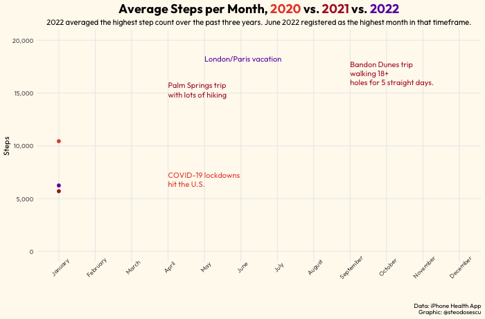
Daily Step Count Heatmap
Lastly, if we want to create a heatmap of steps taken per day of week in each month we can use the fantastic gt() package to highlight our heaviest step count days.
records_out %>%
    filter(year == "2022") %>%
    group_by(weekday, month) %>%
    summarise(month_steps = mean(steps_adj)) %>%
    pivot_wider(names_from = "weekday",
                values_from = "month_steps") %>%
    gt() %>%
    data_color(
        columns = 2:8,
        colors = scales::col_numeric(
            palette = paletteer::paletteer_d(
                palette = "ggsci::amber_material",
                direction = 1
            ) %>% as.character(),
            domain = NULL
        )) %>%
    fmt_number(
        columns = 2:8,
        decimals = 1,
        suffixing = TRUE
    ) %>%
    summary_rows(
        columns = 2:8,
        formatter = fmt_number,
        fns = list(
            "Average" = "mean"),
        decimals = 0
    ) %>%
    gt_theme_538 %>%
    cols_width(
        everything() ~ px(90)
    ) %>%
    cols_align(align = "left",
               columns = 1) %>%
    tab_header(title = md("**2022 Step Counts**"),
               subtitle = glue("Amounts shown are daily step averages in each month. Data is displayed in 000s.")) %>%
    tab_source_note(
        source_note = md("DATA: iPhone Health App<br>TABLE: @steodosescu")) %>%
    gtsave("2022 Step Count Table.png")
My Journey
I said I wouldn’t bore you, so you can skip this part if you don’t care about what my year in steps looked like. But using the above techniques I generated the graphics you saw in this post and arrived at the below conclusions:
I averaged 11,000 steps per day in calendar year 2022 vs. 10,800 steps in 2021 and 9,800 in 2020.
My highest average month was June, where I averaged just over 17,000 steps per day. That was helped by a vacation in Europe where I seemingly walked all of London and Paris.
The lowest month was January with an average of around 6,000 steps.
The day of the week with the highest average was Saturday. I took way more steps on the weekends than weekdays in general.
Tuesday was the weakest day averaging around 9,700 steps.
Conclusion
Today we learned how to export data from the Health app on your iPhone, cleanse the xml-structured data and eventually create stunning visuals with R’s fantastic data processing and visualization libraries.
If you enjoyed this tutorial feel free to subscribe to the free newsletter below or reach out on Twitter. If you found this useful in your data visualization journey with R please share the post, or if so inclined, Buy me a Coffee at the link below.
Lastly, Happy New Year!
I highly recommend reading through the entire blog post — and their entire blog in general — as it is a plethora of useful and interesting analyses using R.
The adjustment calculation is adj_steps = steps*(1/1.7). I arrived at this by comparing the step counts found in these data vs. what’s available in the front end of the app on my phone. Theoretically they should be the same but they weren’t. To account for this I took a sample of about 20 random days and concluded the raw data was over-counting my steps by about 40 percent on average. There was even a day that I supposedly walked 111,000 steps, but common sense would suggest this isn’t even humanly possible. I’m planning on looking deeper into why this is, but for now have simply applied this adjustment.