
How To: Create WSJ airline ranking bump charts and tables
This tutorial will cover increasingly popular chart types using the {ggbump} and {gt} packages in R

Hi everyone,
Today’s tutorial is going to go over how I made the following graphic from last week’s newsletter. I’ll include the code and development process for the plot as well as for the airline rankings table from the post.
If you’re not interested in how the sausage is made feel free to skip this edition of Between the Pipes. For the R-heads out there, let’s dive in.
Airline Bump Chart
Note: This tutorial assumes you have a baseline knowledge of the R programming language and have downloaded R onto your machine. If you’re just getting started on your journey I recommend the P8105 website to get you up to speed.
First, load the necessary packages.
library(tidyverse)
library(magick)
library(gt) #for 538-themed tables
library(gtExtras)
library(glue)
library(ggtext)
library(ggimage) #for working with logos
library(janitor)
library(ggbump)


# don't forget to set your working directory and install these packages on your machine
Then let’s do a little pre-work to set up our plot themes we will use in the bump chart. I decided to go with a black background and use the Outfit typeface for the fonts, similar to my personal website.
#### Load data and Data preprocessing #####

# Custom ggplot theme (inspired by Owen Phillips at the F5 substack blog)
theme_custom <- function () {
    theme_minimal(base_size=11, base_family="Outfit") %+replace%
        theme(
            panel.grid.minor = element_blank(),
            plot.background = element_rect(fill = 'black', color = "black")
        )
}


# create aspect ration to use throughout
asp_ratio <- 1.618

# Table theme
gt_theme_538 <- function(data,...) {
    data %>%
        opt_table_font(
            font = list(
                google_font("Outfit"),
                default_fonts()
            )
        ) %>%
        tab_style(
            style = cell_borders(
                sides = "bottom", color = "transparent", weight = px(2)
            ),
            locations = cells_body(
                columns = TRUE,
                # This is a relatively sneaky way of changing the bottom border
                # Regardless of data size
                rows = nrow(data$`_data`)
            )
        )  %>%
        tab_options(
            column_labels.background.color = "white",
            table.border.top.width = px(3),
            table.border.top.color = "transparent",
            table.border.bottom.color = "transparent",
            table.border.bottom.width = px(3),
            column_labels.border.top.width = px(3),
            column_labels.border.top.color = "transparent",
            column_labels.border.bottom.width = px(3),
            column_labels.border.bottom.color = "black",
            data_row.padding = px(3),
            source_notes.font.size = 12,
            table.font.size = 16,
            heading.align = "left",
            ...
        )
}
Next, we want to define the colors we are going to use in the chart and load the data we’ll use. I googled the official hex color codes for the nine airlines in the WSJ rankings to get these specific colors.
You can read in the dataset from my Github repository — I manually inputted the data from the article into a csv file. Once we have the data read in we use functions from the {dplyr} package to isolate the names of the nine airlines into their own character vector. This will be useful in creating the axes labels for the final plot.
##### Data Preparation #####

# Define colors to be used in viz (colors come from airhex.com)
airline_colors <- c(
    "Delta" = "#9C1C34",
    "Alaska" = "#44ABC3",
    "Southwest" = "#FBAC1C",
    "United" = "#1414D4",
    "Allegiant" = "#FC9C1C",
    "American" = "#C7D0D7",
    "Spirit" = "#ffcd41",
    "Frontier" = "#046444",
    "JetBlue" = "#043C74"
)

description_color <- "grey40"


# read in airline ranking data from github

airline_rankings <- read_csv("https://raw.githubusercontent.com/steodose/BlogPosts/master/Flights/wsj_airline_rankings.csv")


max_rank <- 9

todays_top <- airline_rankings %>%
    filter(year == 2022, rank <= max_rank) %>%
    pull(airline)
It’s now time to make the graphic using R’s fantastic package for data visualization {ggplot2}. The engine behind the bump chart is geom_bump() from David Sjoberg’s {ggbump} package1.
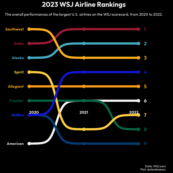
After applying some specific customizations I like for the axes, and adding a title and subtitle, we get the bump chart below showing the Journal’s performance scores of the largest U.S. airlines.
## 1. ------------- Make bump plot ------------------

airline_rankings %>%
    ggplot(aes(year, rank, col = airline)) +
    geom_point(size = 4) +
    geom_bump(size = 3) +
    geom_text(
        data = airline_rankings %>%
            filter(year == 2020, airline %in% todays_top),
        aes(label = airline),
        hjust = 1,
        nudge_x = -0.1,
        fontface = "bold",
        family = "Outfit"
    ) +
    geom_text(
        data = airline_rankings %>%
            filter(year == 2022, airline %in% todays_top),
        aes(label = rank),
        hjust = 0,
        nudge_x = 0.1,
        size = 5,
        fontface = "bold",
        family = "Outfit"
    ) +
    annotate(
        "text",
        x = c(2020, 2021, 2022),
        y = c(0.25, 0.25, 0.25),
        label = c(2020, 2021, 2022),
        hjust = c(0, 0.5, 1),
        vjust = 34,
        size = 4,
        fontface = "bold",
        family = "Outfit",
        color = "white"
    ) +
    scale_y_reverse(position = "right", breaks = seq(16, 2, -2)) +
    scale_color_manual(values = airline_colors) +
    coord_cartesian(xlim = c(2019.5, 2022.5), ylim = c(10, 0.25), expand = F) +
    theme_custom() +
    theme(
        legend.position = "none",
        panel.grid.major.x = element_blank(),
        panel.grid.minor.x = element_blank(),
        axis.text.x = element_blank(),
        axis.ticks.x = element_blank(),
        axis.text.y = element_blank(),
        axis.ticks.y = element_blank(),
        panel.grid.major = element_blank(),
        panel.grid.minor = element_blank(),
        plot.subtitle = element_text(
            margin = margin(t = 3, b = 2, unit = "mm"),
            hjust = 0.5,
            color = "white"
        ),
        plot.caption = element_text(
            color = "white"
        ),
        plot.title = element_text(
            face = "bold",
            size = 20,
            hjust = 0.5,
            color = "white"
        )
    ) +
    labs(
        x = "",
        y = "",
        title = "2022 WSJ Airline Rankings",
        subtitle = "The overall performances of the largest U.S. airlines on the WSJ scorecard, from 2020 to 2022.",
        caption = "Data: WSJ.com\nPlot: @steodosescu"
    )


# save plot in working directory.
ggsave("WSJ Airline Rankings.png")
The end result2:

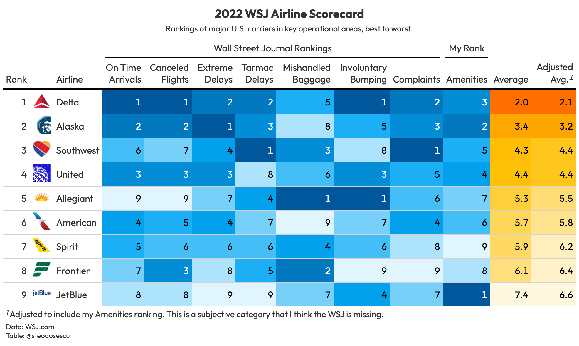
Rankings Table
We can also create a customized version of the WSJ’s 2022 airline scorecard using R’s {gt} package.
Once again let’s read in the data that I’ve already curated beforehand in my Github repo. Next, we make a dataframe that will house the airline logos so we can join them in with the scorecard data for display in the final table.
## 2. ------------- Make GT ranking table ------------------

# read in table from github
rankings_table <- read_csv("https://raw.githubusercontent.com/steodose/BlogPosts/master/Flights/airline_rankings_table.csv") %>%
    janitor::clean_names()

# make dataframe with airline hex images
airline_logos <- data.frame(airline = c("Southwest", "Delta", "Alaska", "Spirit", "Allegiant", "Frontier", "United", "JetBlue", "American"),
                        url = c('https://raw.githubusercontent.com/steodose/BlogPosts/master/Flights/Airline%20Logos/southwest-airlines-logo.png',
                                'https://raw.githubusercontent.com/steodose/BlogPosts/master/Flights/Airline%20Logos/delta-logo.png',
                                'https://raw.githubusercontent.com/steodose/BlogPosts/master/Flights/Airline%20Logos/alaska-airlines-logo.png',
                                'https://raw.githubusercontent.com/steodose/BlogPosts/master/Flights/Airline%20Logos/spirit-airlines-logo-tail.png',
                                'https://raw.githubusercontent.com/steodose/BlogPosts/master/Flights/Airline%20Logos/allegiant-air-logo.png',
                                'https://raw.githubusercontent.com/steodose/BlogPosts/master/Flights/Airline%20Logos/frontier-airlines-logo.png',
                                'https://raw.githubusercontent.com/steodose/BlogPosts/master/Flights/Airline%20Logos/united-airlines-logo.png',
                                'https://raw.githubusercontent.com/steodose/BlogPosts/master/Flights/Airline%20Logos/jetblue-logo.png',
                                'https://raw.githubusercontent.com/steodose/BlogPosts/master/Flights/Airline%20Logos/american-airlines-logo.png')
)


# join tables
rankings_table <- rankings_table %>%
    left_join(airline_logos, by = "airline") %>%
    select(rank, url, airline:amenities) %>%
    mutate(avg = rowMeans(select(rankings_table,
                                on_time_arrivals:complaints),
                          na.rm = TRUE)) %>%
    mutate(adj_avg = rowMeans(select(rankings_table,
                                 on_time_arrivals:amenities),
                          na.rm = TRUE))
I also added average rankings and adjusted average rankings columns to the dataset using mutate from the {dplyr} package. I averaged the seven categories the WSJ outlined in their study and added an eighth for “Amenities” because I felt this was an important component they were missing in ranking the carriers.
From there we can create the table:
# Make gt table

rankings_table %>%
    gt() %>%
    # Relabel columns
    cols_label(
        url = "",
        rank = "Rank",
        airline = "Airline",
        on_time_arrivals = "On Time Arrivals",
        canceled_flights = "Canceled Flights",
        extreme_delays = "Extreme Delays",
        x2_hour_tarmac_delays = "Tarmac Delays",
        mishandled_baggage = "Mishandled Baggage",
        involuntary_bumping = "Involuntary Bumping",
        complaints = "Complaints",
        amenities = "Amenities",
        avg = "Average",
        adj_avg = "Adjusted Avg."
    ) %>%
    # cols_width(
    #     rank ~ px(50),
    #     url ~ px(50),
    #     everything() ~ px(100)
    # ) %>%
    data_color(
        columns = c("on_time_arrivals":"amenities"),
        colors = scales::col_numeric(
            palette = paletteer::paletteer_d(
                palette = "ggsci::light_blue_material",
                direction = -1
            ) %>% as.character(),
            domain = 1:9
        )) %>%
    data_color(
        columns = c("avg":"adj_avg"),
        colors = scales::col_numeric(
            palette = paletteer::paletteer_d(
                palette = "ggsci::amber_material",
                direction = -1
            ) %>% as.character(),
            domain = NULL
        )) %>%
    fmt_number(avg,
               decimals = 1) %>%
    fmt_number(adj_avg,
               decimals = 1) %>%
    gt_theme_538() %>%
    tab_spanner(label = "Wall Street Journal Rankings",
                columns = on_time_arrivals:complaints) %>%
    tab_spanner(label = "My Rank",
                columns = amenities) %>%
    gt_img_rows(url, height = 30) %>%
    tab_header(title = md("**2022 WSJ Airline Scorecard**"),
               subtitle = glue("Rankings of major U.S. carriers in key operational areas, best to worst.")) %>%
    opt_align_table_header(align = "center") %>%
    tab_source_note(
        source_note = md("Data: WSJ.com<br>Table: @steodosescu")) %>%
    tab_footnote(
        footnote = "Adjusted to include my Amenities ranking. This is a subjective category that I think the WSJ is missing.",
        locations = cells_column_labels(vars(adj_avg))
    ) %>%
    gtsave("2022 WSJ Airline Rankings Table.png")
The end result:
Conclusion
Today we learned how to read in a simple dataset from Github, set customized plot themes, prepare data, create a bump charts and table graphics — all using R.
If you enjoyed this tutorial feel free to subscribe to the free newsletter below or reach out on Twitter. If you found this useful in your data visualization journey with R please share the post, or if so inclined, Buy me a Coffee at the link below.
If you want more content like this feel free to subscribe to the newsletter as well.
According to his Github repo: “The R package ggbump creates elegant bump charts in ggplot. Bump charts are good to use to plot ranking over time, or other examples when the path between two nodes have no statistical significance. Also includes functions to create custom smooth lines called sigmoid curves.”